Mike Livermore
CSI 773
October 2010
Redesign of Bad Graph
The Nielsen Company, famous for its television ratings among other things, is involved with various consumer trends analysis. One of these, my example of a bad graph, involves the comparison of various retail channels (supercenter, grocery, drug, mass merchandise, club, dollar, convenience/gas and other) in the change of consumer spending from 2007 to 2008. Specifically, the graph below depicts gains and losses for supercenters, and at whose expense the gains came from; or, in the case of losses for supercenters, which retail channels gained at the expense of supercenters. It does this across ten departments: dry grocery, dairy, fresh produce, frozen, general merchandise, HBA (health & beauty), meat/poultry, non-food, Rx (prescription drugs) and gas. And all of this information is put into a single, pretty stacked bar chart (Figure 1).
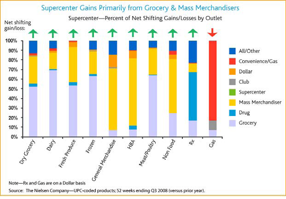
Figure 1: the original chart on the Nielsen News Release
When I first looked at the graph, it took quite a while to come close to figuring out what it really represented. For instance, why does each vertical bar add up to 100% and what does it represent? What do these arrows mean at the top of each bar? Why are some of the retail channels missing in many of the bars? After mulling over the graph and reading the article description a couple of times, I think I figured out the answers. First of all, the lengths of each bar have no relation to each other in terms of a value (such as unit sales); rather, each vertical bar represents the ratio of the losses/gains of all the other retail channels besides supercenter from 2007 to 2008 for the particular department. Second, the up/down arrows represent a gain/loss in that department for the supercenter from 2007 to 2008. Third, each vertical bar shows only those channels which either posted a loss while supercenter gained or gained while supercenter sustained a loss. However, I believe that understanding all the information takes too much time and energy from the user; there are different ways of representing the same information which can be easier for the user to digest.
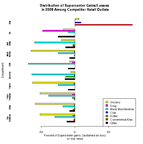
Figure 2: Graph redesign by Mike Livermore
In my redesign, the graph is now a horizontal bar chart where each department is a group of bars representing the retail outlets (Figure 2). The x-axis shows the % of the supercenter gain/loss attributed to the specific outlet; the x-axis label more clearly explains what this value represents. For all of the departments except Gas, supercenters gained at the expense of other channels so these are shown as losses for the other channels and the range is -90 to 0; for Gas it is 0 – 90 showing the other channels’ gains at the expense of supercenters. I believe this design is easier for the casual user to understand what the chart is trying to get across.
The R code which is used is straightforward: read the data into a matrix, adjust some of the y-axis labels, and draw the bar plot:
· xredata = data.matrix(read.csv("RedesignDataNielsen.csv", header = TRUE))
· colnames(xredata)[1]="Dry\nGrocery"
· colnames(xredata)[3]="Fresh\nProduce"
· colnames(xredata)[7]="Meat\nPoultry"
· colnames(xredata)[8]="Non\nFood"
· barplot(height=xredata,horiz=TRUE,beside=TRUE,col=c(1,2,3,4,5,6,7), legend.text = c("Other","Convenience/Gas","Dollar","Club","Mass Merchandise","Drug","Grocery"), args.legend = list(x="bottomright"), xlim = c(-90,90), main="Distribution of Supercenter Gains/Losses \n in 2008 Among Competitor Retail Outlets", xlab="Percent of Supercenter gains (sustained as loss)\n or vice versa", ylab="Department" ,cex.names=.7,space=c(0,2))
References
Nielsen Company (2009). Nielsen: in troubled economy, supercenters showing gains against other retail channels as U.S. consumers shop and buy less. Nielsen News Release on February 3, 2009. Retrieved from http://en-us.nielsen.com/content/dam/nielsen/en_us/documents/pdf/Press%20Releases/2009/February/nielsen%20in%20troubled.pdf